Designer: sketched, wire-framed, and high-fidelity prototyped the UX/UI
Researcher: end-to-end user research of survey, interviews, affinity mapping, user testing and heuristic evaluation
Atlanta pride committee collaboration
Time: 16 weeks
Team: Ruvinee Senadheera, Austin Peete, Sav Philips
Figma
Miro
Illustrator
Qualtrics
Atlanta Pride Committee(APC) had their very first virtual Pride Parade in 2020 due to pandemic. They want to mitigate the stream fatigue with their first scavenger hunt mobile application that can offer the community to engage them in activities. Our team was tasked to help them transfer the Pride festivity and community into the virtual space.
Our team came up with the scavenger hunt mobile app that engage more diverse attendees, provide a dynamic space to interact and bring the community together to celebrate Pride. The app affords both virtual and in-person activities as well as team play or solo play. It also offers more dynamic forms of questions such as videos and images. The messaging features among the participants aid the community easily communicate. It also displays on-going Pride events and updates.
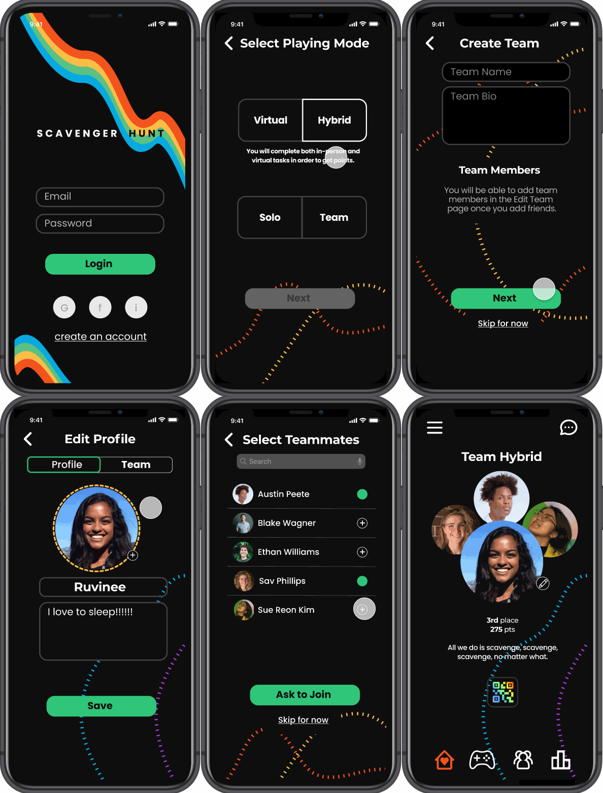
Users can select and play different playing mode: completely virtual version or hybrid (virtual and in-person) version of the game. They can also play as either solo or team
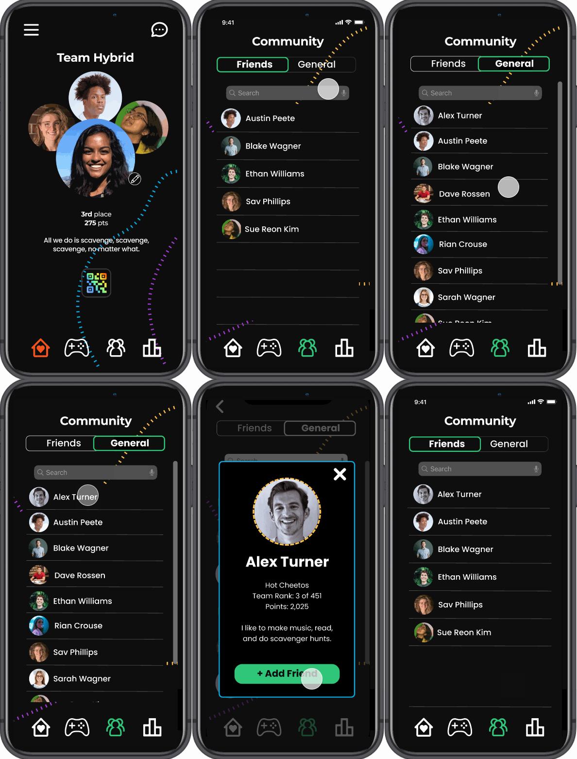
Users can browse the same playing mode folks in their community. This is due to privacy of those who might not be out yet. They can add friends from the community tab and also be able to see other teams/individuals in the leaderboard. Chat function is available to between friends.

Users can browse different types of quests: history, places, movies, science, music. Different quest has different types of media such as audio, video links to answer the questions. When a users gets a question wrong 3 times, it locks out of the question and prompt them to move forward with other quests.
We were able to see some data analytics from the APC and what platforms that the community engage the most. We started our preliminary research with surveys and observation, and dug deeper with interviews. Our target users are LGBTQIA+ community as APC asked. We did not restrict the area since a lot of folks come into Atlanta from all over the place to celebrate Pride.
We started our research with remote survey to see what Pride means to the users and gather the essence of the Pride spirit. We gauge 69 users’ comfort level with virtual events to decide the level of complexity.
A major insight is that they want to feel more presence such as asynchronous in-person activities and we need to create something familiar and accessible for different levels of engagement. We also need to create a sense of community presence within the solution
“The loving atmosphere and seeing that there are so many people who are either a member of the LGBTQ+ community or an ally is what makes Atlanta Pride special to me.”
Our team observed the virtual pride streaming events for 1.5 hours see over 100 users’ comfort level with virtual events and how they interact with each other to connect. We found out they naturally meet and share their social media contacts through chat functions and also reinforces the findings from the survey of different level of engagement - solely participating in the chat, observing, and enjoying it with friends within the same room.
We then interviewed 4 users to define “engagement” in virtual events for our users, thoughts on Atlanta Pride virtual scavenger hunt, and motivations to participating in the game.
We affinity mapped over 300 sticky notes of our research finding and came up with six main themes. Based on these, we were able to create personas and empathy map to understand the users need.

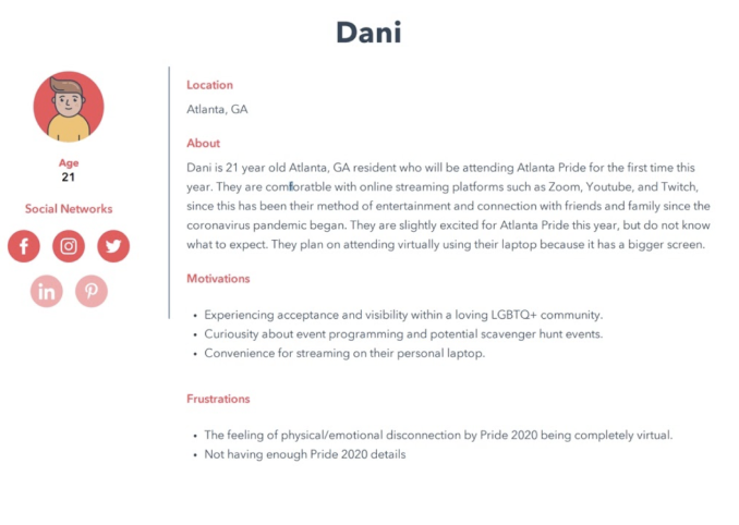
Based on our findings from the research, we created a persona and empathy map to keep in mind our

03. Biggest motivator in scavenger hunts is prizes
-> prizes as motivations
04. What users enjoy the most about pride is the community and people.
-> community engagement
Based on the design requirements, our team each came up with multiple design ideas and combined the best ideas. We also separate some design features that we want to incorporate for this project. Out of 20 design ideations, we picked our top two designs that the best address problem space of the Atlanta Pride Virtual Scavenger Hunt. Then we created flow charts and sketches for those and interviewed experts on our top designs.
First idea is a board-game mobile app, where the main page is the scavenger hunt map. Users are displayed as with an avatar and are able to see other users on the map. In order to move forward, they have to answer prompts and it contains mini games on a certain level so that users can get more prizes as they progress the game.

Second idea is the hybrid scavenger hunt mobile app which affords both in-person and virtual scavenger hunt game, solo or team playing modes with messaging features between users. Users solve different quests related to Pride, and the leaderboard showcases the scores of the participants.
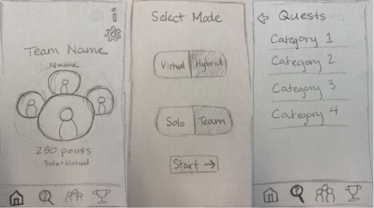
From the sketch feedback session, our wireframe design is changed to
01. Add multiple modes of playing: Solo Virtual, Solo Hybrid(Virtual and in-person game), Team Virtual, and Team Hybrid.
02. Remove sharing their status on their social media since some of the users feel like this will come naturally.
03. Add different types of media for questions and answers.

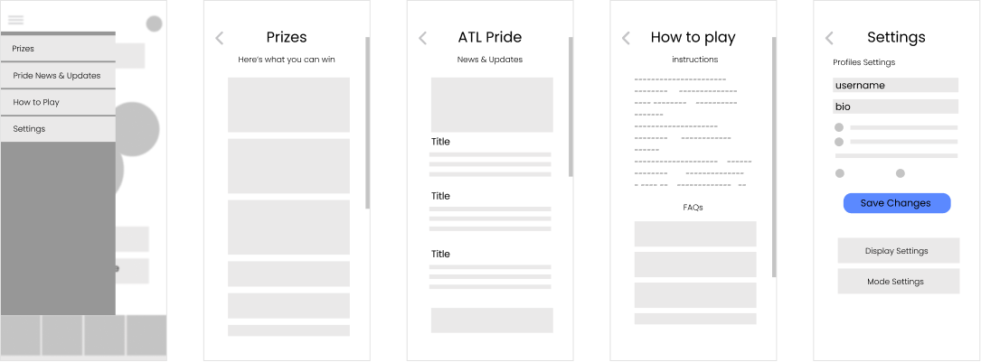

Based on the Wire-frames feedback sessions, users found
01. "Join/Create Team" difficult to follow.
02. "Setting" button is hard to locate, some icons and jargons do not match with their mental model.
We have taken account to those notes and have created a final user flow to create our prototype.

After finalizing the user flow, our team created multiple visual designs that conveys playfulness and representative of the Pride. We came up with more than a dozen different styles and picked our design language after we discussed it as a team.
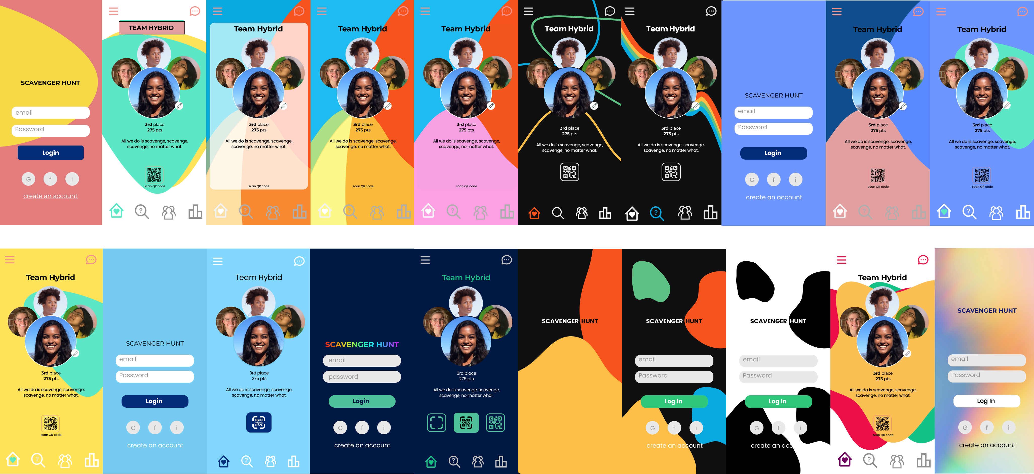

We wanted to incorporate subtle rainbow colors and dark mode for better privacy. However, we agreed that we will need to develop one for a white background for accessibility reasons.
We were able to test the usability of the prototypes with 5 users on the 5 different task completion followed by System usability scale(SUS) questionnaires. All the participants were able to complete the task except for the Task 1. Only *60% of our users were able to complete the task. The average time to complete task 1 was also the longest (74s) despite of the length of the user flow.
However, we received SUS score of 90/100 from the participants, which indicates that once they have explored the app, users find the system very usable. We later learned that this discrepancy is from the *order effect and skewed the data. We also found out that the adding and editing team member user flow is still difficult and needs to be reconsidered.
You can click here and expand to see the results of the task completion.
With 4 experts, we evaluated our prototype using Nielsen’s Heuristic Evaluation in the scale of severity 0-4. The highest severity is the Match between System and the real world (2.25), Visibility of system status (1.5), Help and documentation (1.5), and Consistency and standards (1.5).
01. Needs clear notification system on friends and team
-> implement a new notification system
02. Pencil Icon is hard to find and does not follow the design guide
-> increase the width and weight of the icon
03. Information on Pride and prizes can be more visible
-> rethink the placement of the information
04. Discrepancy between the users mental model on solved quests, unsolved quest, locked out quests and the system.
-> Change the colors to match users mental model.
05. Need to test on the level of community and engagement with the users
-> Facilitate another user testings on the engagement and community to see the platform meets the goal.
.PNG)
As we moved through the journey of end-to-end research and human-centered design, I have learned valuable lessons on communications with the stakeholders and agile iterative design process. It was great to be part of the local community's celebrations, and I hope that our design solution brought APC more interactive engagement within the community.
Some things I will do differently next time:
01. I would love to test on the community engagement through another testing
02. Consider order effect while testing
You can also view my Medium Article: Uplifting the LGTBQ+ community through UX on benefits of having a community sponsor for UX project.
Here is a screenshot of APC’s shoutout on the instagram :)